Hello everyone...sorry for the late updates...it has being an extremely never ending workloads for me for the past few weeks until now...but thank GOD i'm here right now updating stuffsss.
So, the third assignment we have to create a flash intro for our personal website.
I did mine very colorful and simple which represent my personal website. my main inspiration was from a song by Ingrid Michaelson, "Breakable".Its about how fragile, important and tough at the same time is our human heart metaphoracilly. The song describes my personality as well as my website.
Tuesday, 5 May 2009
Thursday, 23 April 2009
Assignment 2 = personal website...
Hello everyone.....it has been a while...but here i am...
My 2nd assignment is a dreamweaver based of my personal website
The concept is very simple and filled with bright cartoony elements. I use rainbow colors in order to create a fun and kiddie website.....
below is my index.html....

Thursday, 5 March 2009
My E-Wallpaper Studio!
So, How on earth that i made that thing!! (...still in shock mode...sorry)
Background....
- Firstly, we get a blank new space with the size of A4
- Then i Flatten my images to turn them into one background!
- Next, i decided to have a shade of color blue for my background
- The reason blue is because...its our MMU official color and blue creates a cool and peace ambiance...(well to me..)
- so, i create another blank layer and fill the layer with color dark blue...
- The results...

Background....
- Firstly, we get a blank new space with the size of A4
- for the background, I've decided to place faces of MMU students...this is because i believe that the students create a whole identity and culture of MMU in general.
-So, i duplicate my selected images and arranged them horizontally across the blank space.
- I choose, a mixture of multiracial faces as MMU consists of international students as well!!!
-The result is as below....(ta-daa...)- Then i Flatten my images to turn them into one background!
- Next, i decided to have a shade of color blue for my background
- The reason blue is because...its our MMU official color and blue creates a cool and peace ambiance...(well to me..)
- so, i create another blank layer and fill the layer with color dark blue...
- The results...

- Then, I came to the part where the texts areas
- I place our MMU LOGO at the top most of the wallpaper
-I also managed to come out with a great motto for the theme...
The Future Corporate Leaders....
- Decided to put some familiar faces as well....hehehe...one of them is me(strong reason was because my image is bigger file size)
-I also add another two yuppies in the wallpaper from the poster shown below...
- Finally, i edited some other important notes on the right side of the wallpaper.
- I placed all the FOM Courses
- I also placed a huge FOM text at the center of the earth....to make it more fom-ish
-I also managed to come out with a great motto for the theme...
(MMU)..."WHERE FUTURE CORPORATE LEADERS ARE DEVELOP"..
(what do you guys think?...over the top much?...me think so too! )
(what do you guys think?...over the top much?...me think so too! )
-Then,Placed the important message of the wallpaper (color= electric blue)
" ...MMU OPEN DAY, 21ST MARCH 2009..."
Calling Mother Earth....!!!!
- Now...where the magic really starts...hehehe
- I came across of our earth image on the net...
-I cropped and placed her at the end most, left corner of my wallpaper!
- Then, in order to make our mother look more alive and powerful, I decided to make her GLOW...or white ray appear from behind gloriously....(mind my movie head)
-So, marqueed the earth slightly bigger
- created another new layer and fill it with white paint.
-Placed the white layer under the earth image layer!...(still can't believe i thought of that)
- Then I enhance the glow effect with Gaussian Blur...Yeay!!!
- I Insert a render effect as well...to make the earth shine and sparkle!!!
-ok....drum roll please.....
The Future Corporate Leaders....
- Decided to put some familiar faces as well....hehehe...one of them is me(strong reason was because my image is bigger file size)
-Cropped my image and place them behind the glowy earth....
- Result...
.
- Result...
.
-I also add another two yuppies in the wallpaper from the poster shown below...
-Firstly, i used magic wand to select image that i want (the main guy in the center and the Chinese girl on his right side.)
- Finally, i edited some other important notes on the right side of the wallpaper.
- I placed all the FOM Courses
- I also placed a huge FOM text at the center of the earth....to make it more fom-ish
- my work is finally done....
-Do give comments....tq
-Do give comments....tq
My E-wallpaper
Friday, 27 February 2009
Brainstorming RESULTS!!!!-E-Wallpaper
Hello! + Nin Hao! + Vanakkam! + Hai!.......to everyone!!...nice to see ya again!
I have finally have a better picture on how my E-wallpaper is going to look like!..
its just a vague idea but at least its something!...so don't judge me!heheh...
First of all i need to thank our Madam Lydia by giving us the chance to refer to her former students works! They are all amazing!!!!!!
Even though their master pieces intimidates me beyond words....but in a positive point of view, their works motivates me to make mine better!!!(i hope)
So Ladies and Gentlemen...here goes nothing...
The reason is simply because the earth image gives an idea to viewers an "international quality" environment. I thought this is appropriate because the MMU introduction by YAB Dato Seri Dr. Mahathir Mohamed really hits the spot reffering MMU as an developing institute towards world class level. Got it from MMU official website... http://www.mmu.edu.my/theuni_mmu/aboutus_intro.php
"Its official launch on July 9th, 1999 by former Prime Minister, YAB Dato Seri Dr. Mahathir Mohamed signifies a heavy responsibility that encompasses the scope of a truly world class institution – to be the catalyst for the development of the Multimedia Super Corridor (MSC) and the nation, parallel to the Silicon Valley's success in the USA"
I would want the earth to glow or shine a bit....or probably inspiring lights appear from behind!
(2) MMU LOGO
Obviously mmu logo is a must!! duh me!
I'm going to place it slightly at the bottom of the earth image ,center
i want the logo to shine or rotates slightly in order to grab the viewers attention!!!
okay...need to go...
to be continued...
I have finally have a better picture on how my E-wallpaper is going to look like!..
its just a vague idea but at least its something!...so don't judge me!heheh...
First of all i need to thank our Madam Lydia by giving us the chance to refer to her former students works! They are all amazing!!!!!!
Even though their master pieces intimidates me beyond words....but in a positive point of view, their works motivates me to make mine better!!!(i hope)
So Ladies and Gentlemen...here goes nothing...
(1) Our Mother Earth
I am going to place a huge Earth image at the center of the e-wallpaper!!!!!The reason is simply because the earth image gives an idea to viewers an "international quality" environment. I thought this is appropriate because the MMU introduction by YAB Dato Seri Dr. Mahathir Mohamed really hits the spot reffering MMU as an developing institute towards world class level. Got it from MMU official website... http://www.mmu.edu.my/theuni_mmu/aboutus_intro.php
"Its official launch on July 9th, 1999 by former Prime Minister, YAB Dato Seri Dr. Mahathir Mohamed signifies a heavy responsibility that encompasses the scope of a truly world class institution – to be the catalyst for the development of the Multimedia Super Corridor (MSC) and the nation, parallel to the Silicon Valley's success in the USA"
I would want the earth to glow or shine a bit....or probably inspiring lights appear from behind!
(2) MMU LOGO
Obviously mmu logo is a must!! duh me!
I'm going to place it slightly at the bottom of the earth image ,center
i want the logo to shine or rotates slightly in order to grab the viewers attention!!!
okay...need to go...
to be continued...
Monday, 23 February 2009
Final assignment bits.....


HI again to my readers!!!
Now, we have finally established our final assignment group leader!
All of us call him Ahteh!
He is okay, looks confident and knows what he is doing
I hope the seven of us can cooperate with each other and contribute towards our final assignment successfully.
so far, i was given a task to look for our local traditional games images and information.
We have decided to go through 5 interesting traditional games:
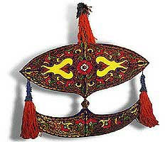
- Wau - i played before...involves lungs jammed running!
- Gasing - a dangerous game...who knows sharp pointy metal can be fun!?
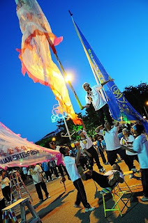
- Chingay -adrenalin rush entertainment much!
- Sepak Raga - worlds hardest ball ever!
- Congkak - very addictive to the max!...well, to me...
I managed to find massive information on our local games through :
- Malaysia's travelling magazines
- Malaysia's traditional games web ( www.unescobkk.org/culture/World_Heritage_Education/ActMalaysia.pdf )...more
- personal interviews with my parents who used to play most of the selected games..
Subscribe to:
Comments (Atom)


